making thru
Making thru optimizes your commuting experience with a simple and intuitive interface. it provides instant rerouting to help you avoid traffic. overviews traffic alerts, construction zones, crashes and hazards to avoid on the road. gas-pricing tips to help you find the cheapest gas on your way. offline navigation and directions guide is offered without the use of internet. this app was developed to better assist your making thru' the day.
commuting made easy.
Making thru is an effort to tackle the annoyance that comes when traveling, not being able to use cel service to get through the city. Making thru was created to be both tangible and intuitive to better your navigating experience.
ideation and process.
Tourists need a way to get around, avoid traffic, and find hotspots without the need of internet or constant use of cellular data. They also need a way to be able to bookmark their favourite spots around the city to reference back to them whenever they want.

system and flow.
Making thru was designed to help users navigate the world faster no matter where they are in the world. Users have the benefit of beating traffic with automatic rerouting, have access to places, and getting directions without data or wifi connection.

aesthetics and visual design.
Making thru was designed with bold, and concise visual elements and a simple app flow so users can get to where they want to even in remote areas.
colours.
Making thru’s colour palette is sourced from Apple's material kit. The primary colours of dark purple and different tints blue set a subdued and serious tone while the pink accent colour adds a sense of vibrancy and excitement.
typography.
The typeface used in the design is the Apple default font San Francisco. For headings the font weight used is SF Pro Bold, and for the body copy and other text found SF Pro Display Regular is used.
iconography.
unlike the other visual elements of this app, Making thru carries it's own authentic iconography. these icons were designed to be equally structured and consistent with the rest of the app's design.
usability experience and task flow.
This app was designed to be accessible be it in popular areas or remote areas. This app was created to help assist users determine locations and guide them through to their final destination.
exploring your area.
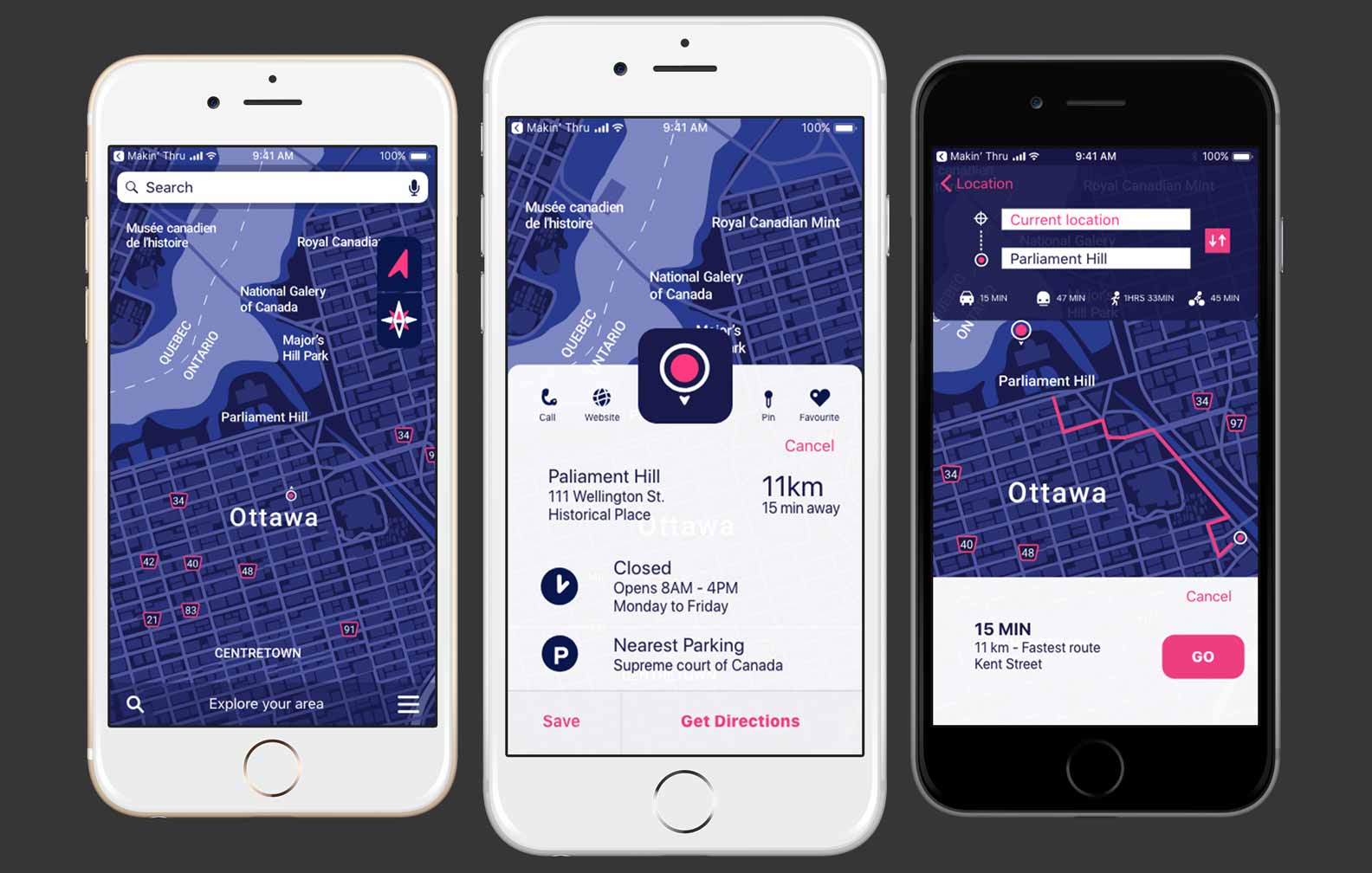
Checkout the hotspots around your area. Discover local stores, restaurants, events, places that aligns with your interest.
getting directions.
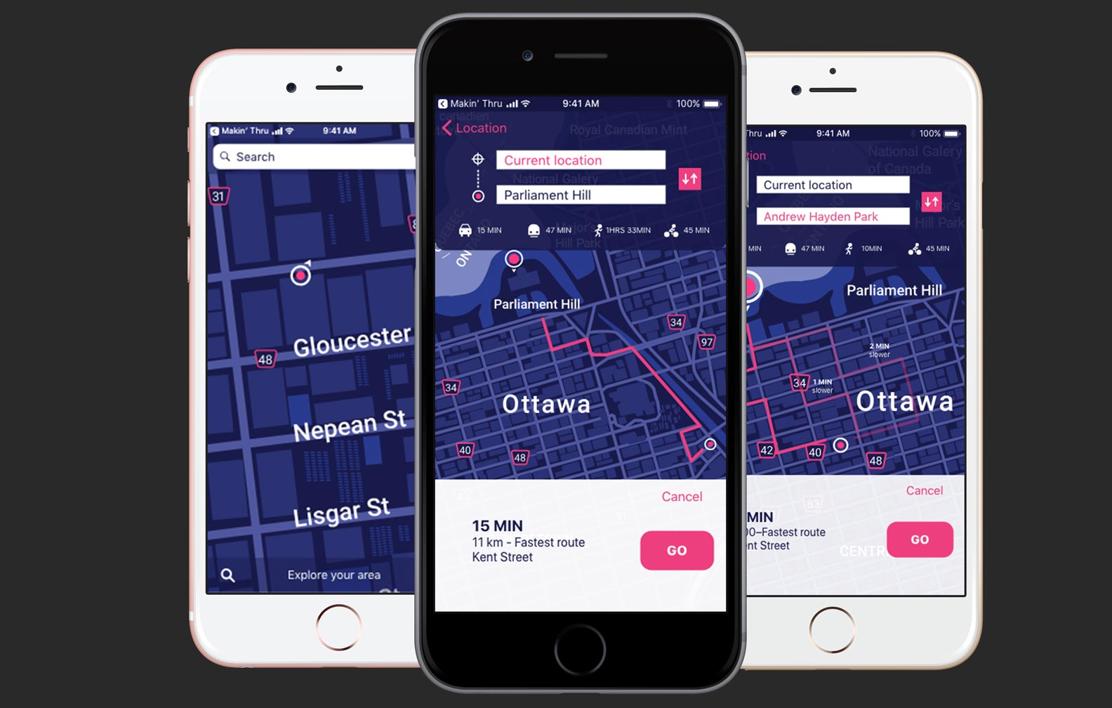
Our GPS guide will take you places, navigate your area and get real-time traffic, transit, road closure and incident information. Making thru is also available and accessible through your Apple watch. This feature allows you to get to your destination no matter where you are in the world.
tagging your hotspot.
Save your favourite places on the gos. Be able to get back to your saved addresses with a tap away. Select your directions and let us help you make your way through.


