SLiDE
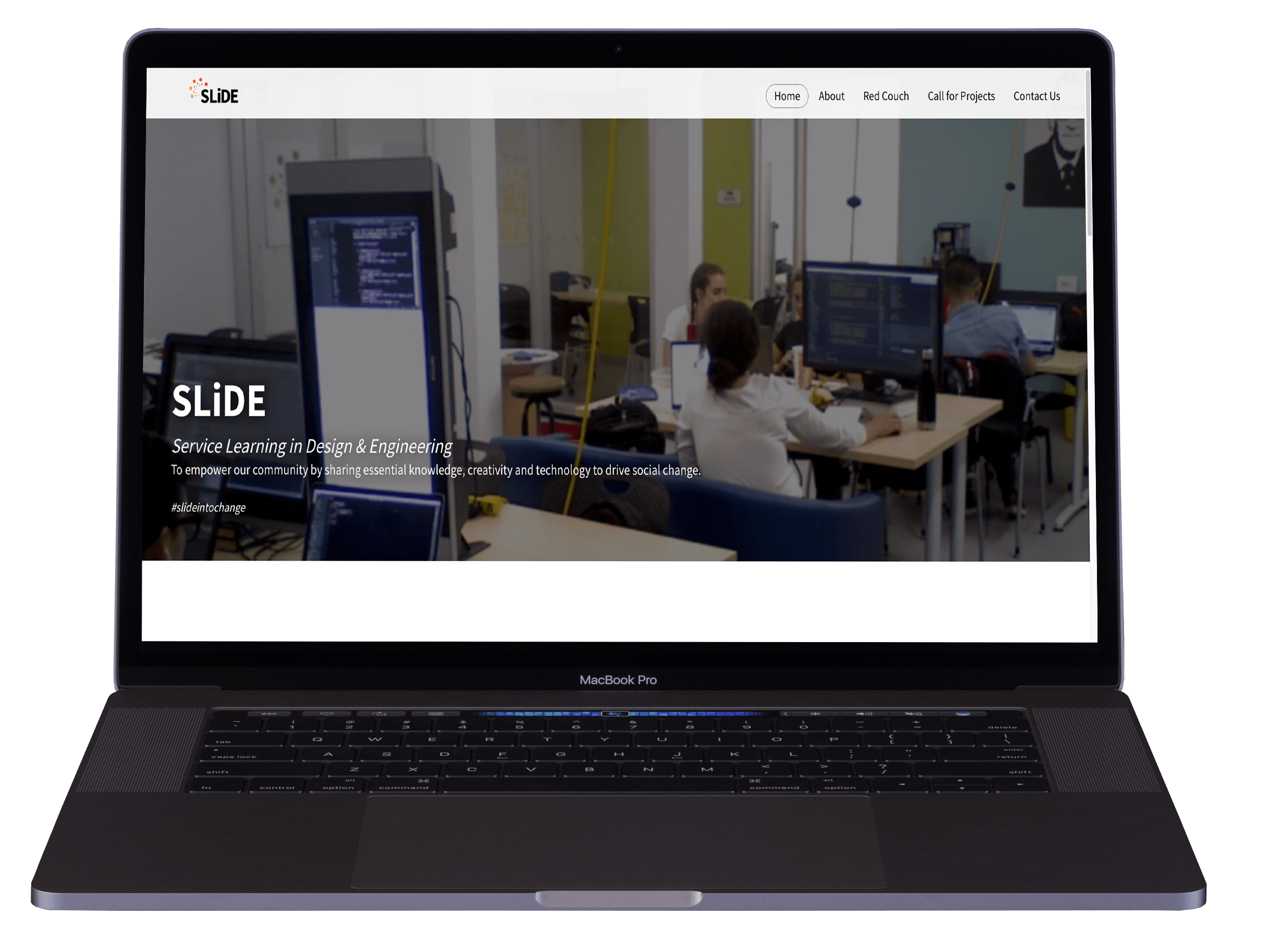
SLiDE–Service Learning in Design & Engineering. SLiDE is a key element of Algonquin College’s response to a 2017 report, recode initiative to maximize the capacity of advanced education institutions to build social ground work for Canadian communities. SLiDE is intended to harness the talents of Algonquin College students from the Schools of Media and Design and Advanced Technology to provide support to community-based organizations in the area of digital technology.
concept for the brand.
the SLiDE logo designs portraits the spirit of community that clients come to appreciate from a competent social agency. one that reflects community, partnership and movement towards change and the future.
ideation and process.
SLiDE being the first program within the new social innovation lab at Algonquin college, the brand was designed to represent flow and transition of development within our community, with bright colours and visual structure of the logos explore movement and transition through the blending of colours.

aesthetics and visual design.
the visual element also helps to reinforce the forward transition that represents innovation and the direction the organization is heading in. This motion and feel and the movement within the logo implies that SLiDE will help propel it’s clients towards their desired destinations and precise problem-solving solutions.
colours.
SLiDE's colour was inspired by two key elements, the community and the students that makes SLiDE. the colour red, which was inspired by the Stanford red couch, represents the social innovation lab and all of the students involved in this social movement, the yellow represents the community of ottawa. the gradient in between the two colors represents the social movement and change that is happening because of the collaboration and efforts of both the SLiDE lab and students.

typography.
SLiDE's corporate typography is a google sourced font called source sans. this font symbolize strength the font weight helps establish presence and professionalism that is expected from a social enterprise.

iconography.
SLiDE's website and brand consist of simple customized iconography. the use of grey tones and outline is to represent the current state of the community and the accent colours is to represent the sectors that SLiDE's student and the social innovation lab are coming in to provide solutions to.
engaging community.
in order to legitimize the lab, a website was created to help give a face to the name of SLiDE and create a channel for community members and enterprises to visit and learn more about service learning.